We thought it would be very key for us to analyse and study the lyrics of our chosen song 'Teenage Dream' in order for us to gain a greater understanding of the meaning behind the song, which would ultimately help us regarding narrative.
The song really seems to tell a story about a girl who is going through her 'first love', her 'teenage love' which is something you always remember. It shows the feelings that young girls go through as they go through this for the first time, and how happy they are. This song in particular, shows how happy the artist is.
We really loved the story of the song, and felt this is something that is really relatable to our target audience. As we are within that target audience, we felt we could really capture this and would therefore stand a much better chance at making it very appealing to our target audience.
Thursday, 29 March 2012
Analysing Magazine Advertisments for Music Artists
We looked at a number of magazine advertisements in order to gain some ideas of codes and conventions of a typical magazine advertisement for an artist within our chosen music genre. One of the ones we looked at was Ellie Goulding.
 |
| Ellie Goulding Magazine Advertisment |
We have also found that the advert will discuss an album, and that it will display reviews from a variety of sources, describing their thoughts of it, these will always be positive, obviously to encourage people to purchase the album themselves. We really liked this, and again, felt it was something we definitely wanted to include upon our own magazine advertisement.
Another factor we found was that, the image of the artist, was not always clear. For example Ellie Goulding's magazine advert, does not show her looking at the camera, the image is side on. Therefore it is not automatically clear as to who the advert is about, minus the name. At first we thought this was not a good idea to try to do and planned to challenge it more, doing something like the 'Jessie J' magazine advertisement where it is made very clear who the artist is. However after more consideration we felt it was a really great way to become more creative and to hint and tease at the audience who is the advert is referring to, whilst making it very clear who it is through the title in order to attract people to it more.
 |
| Jessie J Magazine Advertisment |
We really learned alot through studying the adverts, and i feel this has really benefited us as we come to make our own.
Target Audience
Before beginning our project we had to really consider our target audience, and who we wanted this to be. After choosing 'indie pop' as our musical genre for the project, we had to analyse this in order to understand who we would be aiming our music video at, and what would be most successful in appealing to them. The target audience we are working with in, is women aged 13-late 20's. The 'indie pop' genre has a large number of fans and it includes men and women of a wide variety of ages, however certain artists within that genre will of course appeal to some more than others. We debated that men could too; enjoy the music of Katy Perry, but in regards to target audience we felt her music and the lyrics behind her music were mainly aimed at women. We also thought about how, young girls such as those at the bottom end of the target audience scale (13) would perhaps enjoy the music, but not necessary understand the meaning's behind the song itself. Therefore we narrowed our target audience to a bit older, as we felt this would be the people who would be watching the music video. Younger members of the target audience would always be attracted to the artist, but more through the song itself and pictures, rather than music videos. Therefore, we want to keep the full target audience in mind, but try to focus mainly on the older end of the bracket. Myself and my partner Jess, are within this target audience, and are both personal fans of the genre, therefore we really feel like we will be able to really capture everything a target audience wants through our practical pieces we will make.
Friday, 23 March 2012


Looking at Album Covers
One aspect of our project is to create a album cover to go alongside our music video. In preparation for this, we decided to look at a number of other album covers within the 'indie pop genre', of which we had chosen.
This allowed us to consider some ideas of what we wanted our own music video to look like, through studying the typical codes and conventions of real existing products.
We focused alot on Katy Perry's Album Covers, as she was the artist's song in which we had chosen to do and are a key role model with in the indie pop genre.
We learned a lot through analysing the album covers :
Many of the album covers tended to use 'Mid Shots' to display the artist on the front. We really liked this as it was quite a simple shot, and also meant that we could focus more on the costume, makeup and pose of the model, to really enhance the look of the album.
Artists within the Indie Pop genre, especially Katy Perry, are really well known for really encouraging individuality and originality. They are also known for being quite bold and not 'following the crowd' The image above does not fully reflect this, but was a common factor in a high majority of the other album covers we looked at, a few of which you will see images of below, such as the single 'teenage dream'.
This is a brilliant example of showing the 'indie pop' genre. With the connotations of the genre in a mind, this album cover really captures it with its use of bold and bright colours. The use of a blue wig for the artists really reflects the uniqueness of the genre. The use of neon lights and colours upon this album cover really stood out to us, and we thought this would possibly be something we could try to adapt to our own as felt it really captured the genre, and really stood in relevance to the general look of the album.
Again, this album cover holds a mid shot of the artist. We think this is something we will most likely do ourselves. The use of the mid shot draws more attention to the artist, and that’s the main attraction. We also liked how this one was slightly to an angle and the way in which the artists face is tilted up, with her eyes looking up. It made the album a bit more creative and different rather than a basic mid shot.
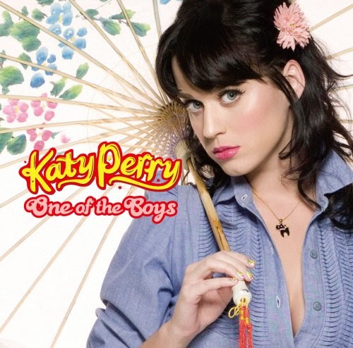 |
| Album Over 1 'One of the Boys' Single |
One aspect of our project is to create a album cover to go alongside our music video. In preparation for this, we decided to look at a number of other album covers within the 'indie pop genre', of which we had chosen.
This allowed us to consider some ideas of what we wanted our own music video to look like, through studying the typical codes and conventions of real existing products.
We focused alot on Katy Perry's Album Covers, as she was the artist's song in which we had chosen to do and are a key role model with in the indie pop genre.
We learned a lot through analysing the album covers :
Many of the album covers tended to use 'Mid Shots' to display the artist on the front. We really liked this as it was quite a simple shot, and also meant that we could focus more on the costume, makeup and pose of the model, to really enhance the look of the album.
Artists within the Indie Pop genre, especially Katy Perry, are really well known for really encouraging individuality and originality. They are also known for being quite bold and not 'following the crowd' The image above does not fully reflect this, but was a common factor in a high majority of the other album covers we looked at, a few of which you will see images of below, such as the single 'teenage dream'.
 |
| Album Cover 2 'Teenage Dream' Single |
Again, this album cover holds a mid shot of the artist. We think this is something we will most likely do ourselves. The use of the mid shot draws more attention to the artist, and that’s the main attraction. We also liked how this one was slightly to an angle and the way in which the artists face is tilted up, with her eyes looking up. It made the album a bit more creative and different rather than a basic mid shot.
 |
| Album Cover 3 'Teenage Dream' Album |
We also found on a number of albums that special effects were used, to create abstract backgrounds. The 'Teenage Dream' album is a good example of this. We really loved this album cover. We thought it was visually striking and stood out against other album covers, however the effects they have used, such as placing clouds in the background and slightly animating her face to be quite 'dolly like' are not factors you 'typically' find on an album cover and were also quite out of our skills range. Therefore there wasn't alot that we were able to take away from this. However we did like the colour schemes and the fonts used for the text. The 'doodle' 'girly' style writing that Katy Perry often uses on her album covers, is something we would really like to try to adapt to our own album cover.
 |
| Album 4 'One of the Boy's Album |
Another factor we found was the use of quite abstract props. Although we really liked this idea, we wanted to stick to our original idea of keeping to a mid shot, like a large majority of the album and single covers we had studied. Although this is something we may try as an alternative.
What this album cover did provide us with, was a good look at costume ideas for the cover. The costumes we have found very frequently on the covers have all been quite bold colours, or bold patterns. This is something we want to remember when choosing what costume we will choose.
Overall we learned alot through looking, analysing and studying the album and single covers and have gained alot of inspiration for our own.
Subscribe to:
Comments (Atom)