 |
| Album Over 1 'One of the Boys' Single |
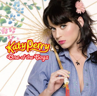
One aspect of our project is to create a album cover to go alongside our music video. In preparation for this, we decided to look at a number of other album covers within the 'indie pop genre', of which we had chosen.
This allowed us to consider some ideas of what we wanted our own music video to look like, through studying the typical codes and conventions of real existing products.
We focused alot on Katy Perry's Album Covers, as she was the artist's song in which we had chosen to do and are a key role model with in the indie pop genre.
We learned a lot through analysing the album covers :
Many of the album covers tended to use 'Mid Shots' to display the artist on the front. We really liked this as it was quite a simple shot, and also meant that we could focus more on the costume, makeup and pose of the model, to really enhance the look of the album.
Artists within the Indie Pop genre, especially Katy Perry, are really well known for really encouraging individuality and originality. They are also known for being quite bold and not 'following the crowd' The image above does not fully reflect this, but was a common factor in a high majority of the other album covers we looked at, a few of which you will see images of below, such as the single 'teenage dream'.
 |
| Album Cover 2 'Teenage Dream' Single |
Again, this album cover holds a mid shot of the artist. We think this is something we will most likely do ourselves. The use of the mid shot draws more attention to the artist, and that’s the main attraction. We also liked how this one was slightly to an angle and the way in which the artists face is tilted up, with her eyes looking up. It made the album a bit more creative and different rather than a basic mid shot.
 |
| Album Cover 3 'Teenage Dream' Album |
We also found on a number of albums that special effects were used, to create abstract backgrounds. The 'Teenage Dream' album is a good example of this. We really loved this album cover. We thought it was visually striking and stood out against other album covers, however the effects they have used, such as placing clouds in the background and slightly animating her face to be quite 'dolly like' are not factors you 'typically' find on an album cover and were also quite out of our skills range. Therefore there wasn't alot that we were able to take away from this. However we did like the colour schemes and the fonts used for the text. The 'doodle' 'girly' style writing that Katy Perry often uses on her album covers, is something we would really like to try to adapt to our own album cover.
 |
| Album 4 'One of the Boy's Album |
Another factor we found was the use of quite abstract props. Although we really liked this idea, we wanted to stick to our original idea of keeping to a mid shot, like a large majority of the album and single covers we had studied. Although this is something we may try as an alternative.
What this album cover did provide us with, was a good look at costume ideas for the cover. The costumes we have found very frequently on the covers have all been quite bold colours, or bold patterns. This is something we want to remember when choosing what costume we will choose.
Overall we learned alot through looking, analysing and studying the album and single covers and have gained alot of inspiration for our own.
No comments:
Post a Comment